Example critique · real Artluni output

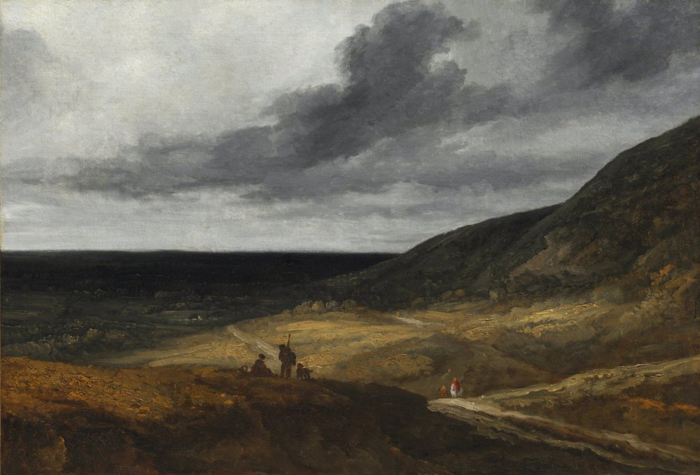
Landscape Near Paris

Georges Michel · c. 1840 · Oil on fabric · Cleveland Museum of Art, CC0

Landscape Near Paris by Georges Michel — artwork critiqued by Artluni

Language: standard Viewpoint: Art critic Tone: balanced Scores Level: advanced Focus: light Focus: composition Focus: values

Question: The bottom of the painting feels dead. What should I do?

Overall impression

This is a confident, atmospheric landscape in the tonal tradition — a valley held under a heavy sky, with small figures giving scale to a lot of air and earth. What already works is the sky: the broad, blended cloud mass carries real weight and weather, and the way the light path threads between dark land and low horizon does the structural job quietly. The bottom third is where the painting currently loses its footing: it reads as a dark, fairly uniform mass, so the eye skips over it rather than entering through it. The single biggest lift would be to give that near ground its own internal value structure and directional marks, so it becomes the entry ramp into the picture instead of a baseboard.
Scores

  • Composition: 6/10 — strong sky-to-land balance, but foreground mass carries too little weight of interest.
  • Light & values: 7/10 — convincing sky values; near ground sits in a narrow dark band.
  • Colour: 7/10 — earthy ochres and cool greys sit well together; foreground warm tones repeat too evenly.
  • Drawing & proportion: 7/10 — figure scale reads true for the vista; near ground shapes are unresolved.
  • Technique & handling: 7/10 — assured painterly touch in sky and hill; foreground marks are hesitant and blended.
  • Impact: 6/10 — mood is real; the lower third holds the whole piece back from landing.

A critic's reading

The painting is about scale and weather — humans as small, deliberate marks inside a landscape that dwarfs them. The form serves that: the horizon sits low, the cloud mass presses down, and the path and hillside give the eye a route from the dark near ground up to the figures and out to the sky, which the eye path traces. The gesture runs roughly from bottom-right along the slope, and it's a good spine — the composition already knows which way it wants to move. Where it's less persuasive is at the start of that journey: a big area of the canvas is doing the job of "dark" and not much else, so the painting's first impression is weight without information.

Its voice is tonal and observational rather than narrative — landscape as mood and light, sitting in the same broad territory as nineteenth-century atmospheric landscape painting and the plein-air tonal tradition. The sky is the most original and personal thing here; the foreground is the most generic. Deepening the near ground's structure — a rut, a stone, a change of plane — would make the whole picture feel investigated rather than staged, and would let the figures feel found rather than placed.

Next steps

  1. To make the near ground read as ground rather than a silhouette, work into the bottom third with attention to plane changes and small value shifts. Block in two or three distinct planes — a lit crest, a shadowed dip, a slightly cooler recession — using a mix of burnt sienna and olive darkened with a touch of the sky grey, keeping everything within a narrow value range but varying the temperature. Then drag a few short, angled strokes along the direction of the slope to describe tumble and scree, matching the mark scale already used on the hillside.
  2. To make the eye travel from front to figures more deliberately, strengthen the tonal step just before the path. Decide where the light actually falls, then lift one or two near-ground passages by half a step so the path reads as the brightest thing in the lower half. A small amount of a light ochre with a little white, applied with a flat and lightly dragged, will do it; keep edges soft where the ground turns away and slightly firmer where it meets the path. This gives the viewer a lit route to follow rather than a jump from dark to mid-tone.
  3. To make the figures hold their place as the focal point, give them one crisp value contrast and one warm accent, and leave everything around them relatively quiet. A small amount of the red you have on the lower-right figure, carried as a single touch on the group, plus a dark accent at their base, will anchor them without adding detail; resist sharpening the hill or sky near them, so their small scale still reads against the weather.

Technique lesson: reading a dark mass as form

The idea is that a dark area only feels solid when it contains a few, roughly correct value shifts that describe plane changes — not more detail, just more decisions.

  1. Squint at the foreground and decide which part would catch the light if the sky's brightest area were the source. Mark that zone mentally.
  2. Mix three puddles: dark (burnt sienna + olive + a little grey), mid (add ochre), light (add a touch of the sky's pale grey-white). Keep them close in value — within about a step of each other.
  3. Lay the mid tone over most of the near ground with a large flat, working along the slope direction.
  4. Place the dark in the hollows and under the crest edge; place the light in one or two bands across the tops of the rises, using the flat on its edge.
  5. Soften only the transitions between planes; leave the outer silhouette against the path a little firmer so the shape of the ground stays legible.

Common pitfall: pushing the light too far and breaking the painting's low-key mood. Keep the lightest foreground tone a step or two below the sky's brightest, and check with a squint — the foreground should still read as one family of values. Self-check: with eyes half-closed, can you still see two or three distinct planes in the bottom third? If it flattens back into one mass, the shifts are too small.

Your question

The bottom isn't dead because it's dark — it's dark and doing one job. Give it three: a plane change, a value step toward the path, and a handful of directional marks that agree with the slope. Do that and it becomes the ramp the rest of the painting needs.

  1. Block in two or three foreground planes with closely related dark values, varying warm/cool rather than light/dark.
  2. Lift one passage near where the path enters the foreground by half a step so the eye has a lit route.
  3. Add short, angled marks across the near ground along the slope direction, matching the mark scale of the hillside.
  4. Squint to confirm the bottom third still reads as one family but with visible structure; adjust only if it goes chalky.

Try this next

A single-session study: repaint just the bottom third at the same scale, twice.

  1. You need one small canvas or board, burnt sienna, olive, ochre, a little grey-white, a large flat and a smaller round, about 45–60 minutes per version.
  2. Version one: three planes only, no detail, values within one step. Keep it low-key.
  3. Version two: same three planes, but lift the passage nearest the path and add directional marks along the slope.
  4. Compare both at arm's length and squinting — which one still feels like the same painting as the sky above?
  5. Success looks like a foreground that reads as one dark mass with visible structure, and that pulls the eye toward the figures rather than stopping it.

Watch how it’s done

Free YouTube tutorials, found and checked automatically.

Cleveland Museum of Art Open Access, 1975.78 (https://clevelandart.org/art/1975.78), CC0.

More examples

Want this for your own work?

Upload a painting, drawing or photo and get a critique like this in seconds — with pointers on your image and follow-up questions. £4.99/month, cancel anytime.

Get started