Example critique · real Artluni output

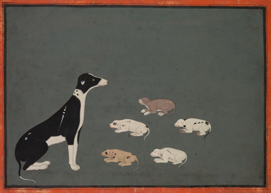
Dog with Pups

Unknown Rajasthani artist · c. 1780 · Gum tempera and ink on paper · Cleveland Museum of Art, CC0

Dog with Pups by Unknown Rajasthani artist — artwork critiqued by Artluni

Language: everyday Tone: encouraging Scores Level: beginner Focus: composition Focus: story

Question: Is all that empty space at the top a mistake?

Overall impression

This is a lovely, confident piece of graphic painting — the black and white adult dog with its crisp silhouette and the row of five puppies already reads as a calm, storybook moment, and the flat grey-green ground gives it real stillness. What it is going for is quiet, almost decorative storytelling, and it already gets there. The single step that would lift it most is deciding what that upper field is for — right now it reads as untouched, and a small amount of considered treatment would turn it from leftover into intention.
Scores

  • Composition: 6/10 — strong placement, but upper field feels unassigned
  • Light & values: 6/10 — bold contrast on the adult, softer on puppies
  • Colour: 7/10 — muted palette is cohesive and the border sings
  • Drawing & proportion: 6/10 — stylised neck reads deliberate, puppies a touch uniform
  • Technique & handling: 7/10 — clean lines, smooth flat colour, steady hand
  • Impact: 6/10 — charming and clear, still waiting for a finish

What's working

  1. Silhouette clarity. You have built the adult dog almost entirely from shape — the pale chest against the deep black body reads instantly, and the thin outline keeps the edges poised. Keep using outside outline to describe form; it's your strongest tool.
  2. Disciplined negative space. The big open field genuinely creates stillness, and the eye path from the dog's head across to the puppies is unaided and easy to follow. Your instinct for pacing — one large form, several small ones — is working.

Next steps

  1. To make the empty upper area feel intentional rather than unfinished, look at the top third. Right now the tone is a single flat wash. Adding a subtle variation — a slightly darker band low, lighter high, or a few very faint marks — tells the viewer it was a decision. Do it as follows:
  2. Mix your grey-green slightly darker than the current field.
  3. With a wide soft brush, lay a thin band along the top edge only, keeping it uneven.
  4. Soften the lower edge of that band with a barely damp brush while wet.
  5. Step back — you want to sense it more than see it.
  6. To make the puppies read as a group and not a row, look at the five forms. They're spaced fairly evenly and all face similar directions; a small change in spacing or tilt creates relationship. Try:
  7. Sketch on paper: three puppies close together, one further away, one behind the adult's leg line.
  8. When you repaint, overlap two so one hides a paw of another.
  9. Give one puppy a tilt of the head toward the adult.
  10. Keep the same flat colour handling you already do well.

Technique lesson: grounding forms with a simple shadow

Idea: a single soft shadow shape under each figure is enough to say "these are on a surface together" without adding a floor line, which would break your lovely flat world.

  1. Choose a grey two steps darker than your background — not black.
  2. With a small round brush, lay an oval under the adult's paws, wider than the paws and flattened.
  3. Do the same under each puppy, smaller and lighter the further they sit.
  4. While still wet, drag the far edge of each shadow outward with a clean damp brush so it fades.
  5. Let it dry fully before touching the outline again.

Common pitfall: making shadows too dark or too sharp, which makes the animals look cut out and stuck on. Keep them subtle and soft-edged.

Self-check: squint at the piece — if the shadows disappear into the background you've got the strength about right.

Your question

No — the empty space at the top isn't a mistake, and I'd gently push back on the word. It is the calm part of your painting, and it's what makes the dogs feel small and still. The real question isn't "is it wrong" but "is it finished", and that's the only thing I'd change.

  1. Decide what the field is: sky, wall, or simply paper. Any of those is fine — but pick one.
  2. If it's sky, add a slow change in tone from top to lower area.
  3. If it's a wall, add two or three faint horizontal hints far apart.
  4. If it's just space, leave it — but then thin or remove anything that suggests a place.
  5. In all cases, check the balance: the top third should feel as considered as the bottom.

Try this next

A ten-minute placement study to test your layout before you commit.

  • You need: a small sheet of paper, pencil, and a grey marker or soft pencil.
  • How long: 10 minutes.
  1. Draw a rectangle the same shape as your painting.
  2. Block the adult dog as one dark shape and the puppies as five small dots — no detail.
  3. Draw a line where you want the viewer's eye to travel.
  4. Try three versions: puppies in a tight cluster, puppies spread, puppies overlapping the dog.
  5. Circle the one where the eye path feels most natural.

Success looks like: you can see at a glance which arrangement tells the clearest story, before you mix a single colour.

Watch how it’s done

Free YouTube tutorials, found and checked automatically.

Rajasthan, Ajmer, probably Sawar school. Cleveland Museum of Art Open Access, 1969.77 (https://clevelandart.org/art/1969.77), CC0.

More examples

Want this for your own work?

Upload a painting, drawing or photo and get a critique like this in seconds — with pointers on your image and follow-up questions. £4.99/month, cancel anytime.

Get started