Example critique · real Artluni output

Still Life

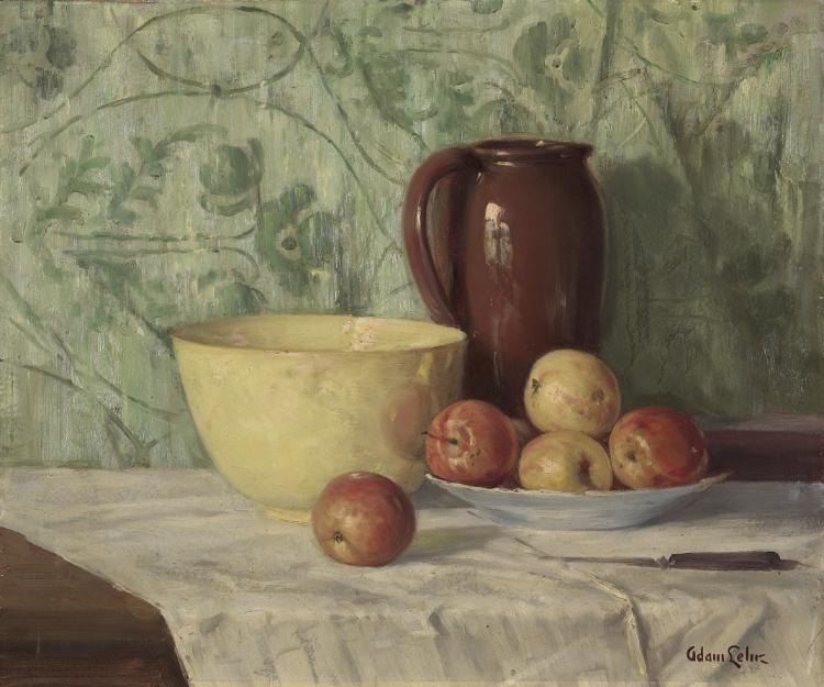
Adam Lehr · 1923 · Oil on canvas · Cleveland Museum of Art, CC0

Still Life by Adam Lehr — artwork critiqued by Artluni

Language: everyday Tone: encouraging Scores Level: intermediate Focus: values Focus: light Focus: edges

Question: Why does my bowl look flat compared to the jug?

Overall impression

This is a warm, confident still life with a real sense of mood — the sage-green patterned wall, the deep burgundy jug, and the soft cloth all sit together in one colour world, and the painterly brushwork gives it life. You've already done the hardest thing well: the jug reads as a solid, round object with weight. The single step that would lift the whole piece most is carrying that same light-behaviour onto the bowl, because right now the bowl is doing less work than everything around it. Take that next.
Scores

  • Composition: 7/10 — traditional triangle works, eye path reads clearly
  • Light & values: 6/10 — jug convincing, bowl's light-to-dark range too narrow
  • Colour: 8/10 — green/red harmony is genuinely lovely
  • Drawing & proportion: 7/10 — vessels feel sturdy, rims sit well
  • Technique & handling: 7/10 — loose, honest marks, nice edge variety
  • Impact: 6/10 — mood is strong, focal pull weakened by flat bowl

What's working

  1. The jug's full range of light. You've committed to a bright spot on the left shoulder and let the right side fall into genuinely dark paint. That's a three-stop journey — light, mid, dark — and it's exactly what makes the jug feel round. Keep doing this on every form.
  2. The colour harmony and loose background. The sage wall and its gestural swirls sit back and don't compete, while the reds and yellows come forward. Warm against cool, busy against calm — that's deliberate and it's working.

Next steps

  1. To make the bowl feel as round as the jug, look at the large pale-yellow bowl on the left. Its front surface is almost one flat light tone, so it reads like a cut-out. Build a slower light-to-dark run across it.
  2. Squint at the jug, then the bowl, and compare: the jug has three clear zones, the bowl nearly one.
  3. Mix two extra versions of your bowl colour — one a step lighter, one two steps darker — on the palette.
  4. Paint the left third with the lightest mix (near where light comes from, upper left), the middle with your current tone, the right third with the darker mix, blending wet-into-wet where they meet.
  5. Keep your brightest spot only at the very top-left curve, not smeared across the front.
  6. To make the bowl's shadow turn the corner, look at where the bowl meets the cloth on the right. Right now the shadow stops short, so the base floats.
  7. Load a small flat brush with a mid-dark version of the bowl's own colour.
  8. Run a soft band down the lower-right curve, following the round of the rim's ellipse.
  9. While wet, drag it slightly under the base onto the cloth as a cast shadow, softer and greyer as it moves away.
  10. Soften the inner edge with a dry brush so the shadow wraps, not stripes.
  11. To sharpen your variety of edges, look at the apples. Many edges are similarly soft, so the fruit merges. Pick just one or two — the front apple or the top of the yellow one — and crispen their outlines against the cloth with a fine liner brush while leaving the rest soft. Hard edges draw the eye and add sparkle.

Technique lesson: Reading form as three zones

Every rounded object shows three zones of light — a lighter side facing the light, a middle tone, and a darker side turning away. If any zone is missing, the object flattens.

  1. Set the object under one light source and squint until you see just three bands across it.
  2. Mix three puddles: light, mid, dark — all from the object's own colour, not black.
  3. Block the three zones in broad strokes, following the curve of the form (not straight up and down).
  4. Blend only where two zones meet, wet-into-wet, so the change is gradual.
  5. Save your single brightest dab for the top-left curve, and your darkest for the far side.

Common pitfall: making the dark zone too dark on a pale object, which greys it out. On the yellow bowl, keep your darkest mix warm and close to the local colour.

Self-check: photograph or squint at the piece — if you can still name three zones on the bowl, you've got it.

Your question

Your bowl looks flat because it's missing the middle and dark zones. The jug shows a bright spot, a mid-tone, and a deep shadow side, so it turns in space. The bowl shows mostly one light tone across its front, with only a faint shadow on the right — so there's nothing for your eye to read as a curve.

To fix it:

  1. Mix three versions of your bowl yellow: light, mid, dark.
  2. Paint the left third light, the middle mid, the right third dark.
  3. Blend the joins wet-into-wet.
  4. Add a cast shadow under the right base onto the cloth.
  5. Keep the brightest dab only at the top-left rim.

Try this next

Three-zone study — 20 to 30 minutes.

  1. Put one round object (an apple or cup) under a single lamp from the upper left.
  2. Mix only three tones of its local colour.
  3. Block the three zones in five minutes, no blending.
  4. Re-do it in twenty minutes, blending only the joins.
  5. Squint at the end — success is seeing the form turn, with the brightest dab top-left and the darkest far right.

Watch how it’s done

Free YouTube tutorials, found and checked automatically.

Cleveland Museum of Art Open Access, 1926.165 (https://clevelandart.org/art/1926.165), CC0.

More examples

Want this for your own work?

Upload a painting, drawing or photo and get a critique like this in seconds — with pointers on your image and follow-up questions. £4.99/month, cancel anytime.

Get started