Example critique · real Artluni output

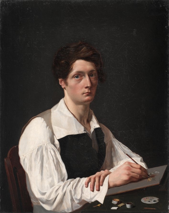
Self-Portrait

François LePage · 1824 · Oil on canvas · Cleveland Museum of Art, CC0

Self-Portrait by François LePage — artwork critiqued by Artluni

Language: academic Tone: balanced Level: advanced Focus: values Focus: light Focus: anatomy

Question: Does the face hold attention against all that white shirt?

Overall impression

This is a poised, self-possessed self-portrait in the Romantic manner — a young painter at the easel, head turned to meet us, brush hovering above a small panel. The chiaroscuro strategy is already doing its job: the figure reads as a solid volume against a near-black ground, and the white sleeves have real weight. The single step that would lift it most is a firmer value hierarchy inside the lights — separating the neck and collar into their own value family so the shirt stops competing with the face, and letting the ground carry a touch more atmosphere.

What's working

  1. Chiaroscuro organisation of the silhouette. The hard edge where the shoulder and sleeve meet the dark ground against the soft, painterly transitions within the folds is exactly the right instinct — it's the "lost and found" edge principle, and it pushes the figure forward while keeping the interior modelling believable. Keep protecting the lost edge under the puffed sleeve, where the white almost dissolves into shadow.
  2. Directional framing through value mass. The dark hair and the dark vest create a V-shaped dark mass that locks the eye into the face. This is compositional repoussoir in miniature — the eye path you've built runs sleeve → vest → face → gaze back out, and the gaze return is what makes the portrait hold. The controlled, blended brushwork in the sleeve highlights supports this without stealing attention.

Next steps

  1. To make the face win the value contest more decisively, work on the neck and collar opening [r1, r2]. Right now the white of the collar adjacent to the jaw carries a value close to the jaw's lit plane, so they read as one light family.
  2. Mix a lower-value white — a grey-white with a touch of raw umber and cool blue — and glaze it thinly over the collar's lit side.
  3. Keep a small strip of the highest value (nearest pure lead white) only on the forehead, the top of the cheekbone, and the bridge of the nose.
  4. Rework the terminator on the neck (the shadow-side boundary) so it turns more sharply than the cheek — this separates neck from collar.
  5. Step back and squint: the face should read as the brightest dense area, the shirt as the brightest broad area at lower value.
  6. To give the ground air while keeping the figure forward, introduce atmospheric modulation in the background.
  7. With a wide flat, lay a thin scumble of neutral grey-brown (raw umber + a whisper of ultramarine + lead white) in a soft oval behind the head.
  8. Keep the corners as the deepest darks.
  9. Feather the transition so no hard edge appears in the ground — the figure's silhouette edge should stay hard while the ground softens behind it.
  10. To strengthen the hand's anatomy at this level, check the relationship between the brush-holding hand and the support it rests on.
  11. Block the palm as a single rounded plane before describing fingers.
  12. Locate the knuckle line as a diagonal, and build the fingers as cylinders with a clear core shadow on the underside.
  13. Check that the thumb's thenar mass reads as a wedge from the wrist — this is what gives the grip weight.
  14. Keep the resting hand's fingers slightly lower in value than the working hand to imply depth.

Technique lesson: value hierarchy within the lights

The idea: in a high-key portrait, not all whites are equal — you assign a "ceiling" of value to the shirt and a higher ceiling to the face, so the face dominates even though both sit in the light.

  1. Mix three light strings on the palette: a white for the face highlights, a grey-white for fabric highlights, and a cool half-tone for fabric shadows.
  2. Block the entire shirt in the grey-white first — no pure white yet.
  3. Place face highlights last, using the purest, thickest paint (impasto on the forehead and cheekbone).
  4. Compare with a value scale held at arm's length against the canvas.
  5. If the shirt reads brighter than the face, glaze down the shirt, don't lift the face.

Common pitfall: chasing the brightest white everywhere in the lit passages, which flattens the hierarchy. Avoid by reserving your purest tubed white for the face alone.

Self-check: squint — the face should still be the anchor after the details disappear.

Your question

Yes — the face holds, but partly through the dark hair and vest doing the framing work for it. To make it hold on its own value, reduce the collar and neck by one step and reserve pure lead white for the forehead, cheekbone and nose bridge. Steps:

  1. Glaze the collar's lit plane with a grey-white.
  2. Sharpen the neck's terminator.
  3. Re-place face highlights last.
  4. Squint-check: face should now carry the strongest value contrast, not the shirt.

Try this next

Practice: a 45–60 minute study of a single lit white form (a shirt cuff or a folded napkin) beside a lit flesh tone. Materials: a small panel, lead white, raw umber, ultramarine, a flat and a filbert.

  1. Block both forms in mid-tone grey-white.
  2. Build face/flesh with warmer, higher-chroma lights.
  3. Keep fabric cool and one value step lower.
  4. Place the highest-value accent only in the flesh.
  5. Compare side by side.

Success looks like: the flesh reads as the subject and the fabric as the support, in a flattened thumbnail view.

Watch how it’s done

Free YouTube tutorials, found and checked automatically.

Cleveland Museum of Art Open Access, 2004.17 (https://clevelandart.org/art/2004.17), CC0.

More examples

Want this for your own work?

Upload a painting, drawing or photo and get a critique like this in seconds — with pointers on your image and follow-up questions. £4.99/month, cancel anytime.

Get started